Ink Well
April 24, 2000
by Frank Di Luzio
It seems that one of the least exploited features in Director is the ink property. Many of its effects are hard to predict and plan for. But, with some experimentation, you can obtain striking results using inks. Since experimentation is time consuming and projects often don't allow for it, I would like to show you some ink-based effects that might help you solve a particularly difficult visual task or give some part of your project that "special" look. I have used inks to produce complicated looking visual effects that are not complicated in the least. More than half the inks in Director are color modifiers, therefore, you need to know how color works in general.
Sample movies of the following examples are available for downlaod in Mac (692 K)or PC (580 K) format.
Light Color Theory
Basic color theory provides a better understanding about color ink effects. Since the computer monitor displays color as light, as opposed to a painter's palette, it is useful to know how color is produced by light.
White light is a mixture of all the colors in the visible spectrum. Most of us have seen the colors of the visible spectrum boldly revealed in a rainbow. When white light passes through a prism it is split into the three primary colors of light; red, green and blue. You can make any color by mixing the three primaries in varying amounts. If you put them all together again, you get back to white. This kind of color formation is referred to as additive color and can be demonstrated in Director using primary colors as three overlapping circles. I'll explain later about of what is happening in the overlapping areas.
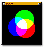
This example using the ink Add Pin can only work properly over a black background, since black is the absence of light. Any color other than black would be added to the pure colors of the circles. However, the white center will always remain white because it already has the maximum amount of the three primary colors as defined by monitors (ie. R=255, G=255, B=255). It just doesn't get any whiter than that.
Additive colors are instinctive, since we perceive the world in this manner. As you might expect in a world of opposites, the contrary to additive color is subtractive color.
Subtractive color works by blocking light. Where additive color combines to make white, subtractive color combines to make black. I say "make black" because that is easier to visualize. Actually, it is opaque. Imagine the white background in this example to be a light source. Again, I'll explain the overlapping areas later.
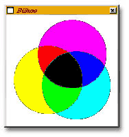
This example using the ink Subtract Pin can only work properly over a white background. Since white is comprised of all the colors of light, color is produced here by the sprites blocking some colors and letting others pass through. Anything other than white would not produce the pure colors of the circles. However, the black center will always remain black because no amount of light can pass through it.
The first step in evaluating color in ink effects is to determine whether the effect is additive or subtractive in nature. Once you've determined this, you can make judgements about how colors will be handled with the help of a color wheel.

In the first example, I overlapped a red, green and blue circle. I used exactly the same three circles in the second example as well, but a different ink. What you see in the second example are the complementary colors of the original circle colors. Complementary colors are opposite each other on the color wheel. Therefore, blue turns yellow, red turns cyan, and green turns magenta. The relationship from one color to the other is its opposite(ie. additive vs. subtractive).
You can also see how the overlapping colors come to be because any color on the wheel is made up of equal amounts of the colors right and left to it. Therefore, red and green make yellow in the first example and cyan and magenta make blue in the second example.
Knowing how a color ink effect is working in general (ie. additive or subtractive) and using the color wheel, you are more likely to be able to control how that effect will look.
Applying Inks in Director
There are several ways to apply the ink effect to a sprite in authoring mode. After applying inks, you may need to consider in which layer the sprite exists. Lower sprite numbers are beneath higher numbered ones. This can make a difference when using several sprites with ink effects.
Score Method
In the score window, select a sprite and find the pop-up menu with the word "copy" in it. Click on it to display a selection of ink effects. Click on the one of your choice.
Select a sprite in the score and use a similar pop-up menu in the sprite inspector.
Select a sprite on stage while holding down the command key on the Macintosh or the Ctrl key on Windows.
Lingo Method
You can change the ink of a sprite with the following syntax:
sprite(whichsprite).ink = ink_index
A list of ink index numbers can be found in the menu Help / Lingo Dictionary under "ink". Generally, ink effects lower in the list are more processor intensive.
Ink Effects: Examples
The best way to appreciate ink effects is to see them in action. I'll explain briefly how I achieved each result.
Ameba: lava lamp style View
This is perhaps the most fascinating accident I ever had with inks. It contains thirteen sprites using the Subtract ink. Since this is a subtractive color effect, the blue ameba's member is really a yellow circular gradient on white. Basically, I started with a yellow circle in a transparent layer in Photoshop. I created another, slightly larger one of the same color in a layer behind it. I applied the gaussian softening filter strongly on the larger circle and mildly on the smaller one. This creates a denser center than just softening one circle alone. I then reduced this onto a white background and imported it into Director. It took a lot of trial and error with the gradation to get the right amount of gooeyness between the sprites.

The sprites are placed at careful distances from one another to create the look you see here. One sprite is moving along the outer edge of the mass. This accounts for the change in shape. By clicking on change member, you merely change the member of all the sprites. The other members were created the same way as I explained except I used two different colored circles and the gradations are not identical to that of the blue ameba. A lesser gradation can be observed by the member which detaches itself from the mass and then comes back. This is not due to a change in path, but a change of member.
If you click on snake, one sprite is set to the mouse position. The remaining sprites are linked like a chain and were programmed so that each sprite follows the one in front of it. The movement of the trailing sprites doesn't start until the linked sprite is more than thirty pixels away. You can observe how important the distance between the sprites is in creating this effect.
Red blood corpuscle: flow View
It always makes me smile when someone asks me how I warped these sprites. There is no warping at all, it's just an ink effect. The moving sprites aren't altered in the least except for their position. The member is a red circular gradient I created in photoshop by using the gaussian filter on a red circle on black. After importing it in Director, I dragged and positioned this member many times onto the stage to create the channel the corpuscle will flow through. I scaled some sprites to create oval shapes.
The corpuscle flow is made of five sprites moving from left to right. The movement was created in the score so that the sprite slows down in the middle and then speeds up again just after the sprite leaves the tight spot. I deliberately let some sprites bump into each other for a more realistic look.
The ink Lightest is responsible for creating the form fitting effect because this ink compares and shows only the lightest of overlapping colors, no mixing occurs between the gradation of the sprites.
Kaleidoscope: pinwheel View
I was working on a project where I had to rotate sprites and I somehow got lost in thought and came up with this mesmerizing pinwheel. It uses various linear gradations spinning in circles with the stage middle as the axis. I made four separate solid stripes in the Director paint window and then filled them with different color linear gradients. I dragged each of them into the score and then set a 45, -45 and 90 degree rotation value for three of the stripes to form an asterisk shape(*). A simple behavior changes the rotation of the sprite on exit frame. The trails is set to true and I set the ink of sprite by randomly picking an ink effect index stored in a list. The expanding middle is a duplicate set of gradients being scaled from small to large beginning in the center. You can look at this for hours and never see the same pattern.
Flashlight: adjustable ambient light View
I tackled this problem on and off over the years looking for solution. There are several ways to create a flashlight effect but it always bothered me that the background was black. I wanted to see the image in shadow as well as where the flashlight lit it up. This technique uses three inks: Darken, Copy and Darkest.
The flashlight member was imported with an alphamask using PhotoCaster. It consists of a black soft edged circle on a transparent background in Photoshop. The background and foreground image are the same picture. I placed them in the score with an empty sprite channel in between. I put the black soft-edged circle in this channel and programmed it to follow the mouse. It has Copy ink. The background sprite has the ink Darken and the foreground sprite has the ink Darkest. By changing the back color of the lowest sprite to a different shade of grey, you can achieve different levels of brightness in the image. I also added a slight blue tint to the outer edge of the flashlight to make it more realistic.
Animated color gradient text with text member View
It always intrigues me when I can use an ink to make something invisible to the eye even though it's really there. In this movie, I use a normal text member with white letters on a black background. There is a huge rainbow gradient moving vertically above it with the ink Darkest. It is only revealed in the white text.
Police light style fade View
This effect is achieved by scrolling a black to white linear gradient, with the ink Subtract Pin, horizontally over an image. The ink effect on the gradiation causes different opacity levels of that sprite in relation to the shade of grey in the gradation. Black reveals the image in its original state while every shade of grey towards white blocks the underlying image slightly more. White effectively blocks the image entirely.
Wave Text View
In this example, I have two sprites with different members. The members are basically the same image except one is a brighter, out of focus version of the blue text you see on stage. That sprite is above the one containing the normal blue text and has the ink mask. As is required for this ink to work, I placed the member I want to use as a mask directly after the out of focus member in the cast. The mask is a thick black line with soft edges at a slight angle, like the slash on the keyboard, equal in height to the member it is masking (the out of focus text). You can see that image on stage only through the areas of the mask that are not white. At first, this should be some part in the middle of the text since the registration points of the members are centered at onset.
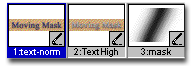
Now here's what's happening, I move the registration point of the mask member using lingo which causes it to change its position in relation to the image it is masking. That means a different portion of the image will be visible depending on where the mask is. The change you see on stage is the mask traveling left to right revealing a different portion of the out of focus blue text.
Furthermore, every second pass of the mask, I move the masked sprite upward so it is not in register with the underlying one. That's what causes the wave movement in the text.
This is the code I use in a frame script to move the registration point of the mask and to offset the sprite by 5 pixels. The movie never leaves the first frame.
global gVshift
on exitFrame
if member("mask").regpoint[1] > -130 then
-- move regpoint 12 pixels to the right
member("mask").regpoint = member("mask").regpoint - point(12,0)
else
member("mask").regpoint = point(245,41)
gVshift = not(gVshift)
if gVshift then
sprite(2).locV = sprite(2).locV - 5
else if not(gVshift) then
sprite(2).locV = sprite(2).locV + 5
end if
end if
go the frame
end
Shading: View
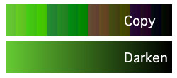
In this movie, each side of the cube is a separate sprite with the ink Darken. To use the ink Darken, you must change the color of that sprite to something other than the default black or white to observe an effect. A white sprite back color shows the member unchanged, while every darker shade of grey darkens the image until it finally reaches black.
The advantage with the Darken ink is that the image still looks right. If you change the back color of the sprite with the ink Copy, you may get strange posterizing effects depending on the color. In fact, if you want to tint bitmap sprites in general, you should use the ink Darken for best results. Just look at what has happened here to a black and white gradation with the back color set to green.
Here is the code for the shading. It defines a point (x,y) and changes the background color of the sprite to a darker or lighter shade of grey depending on the distance the face(sprite) center is to it. You can manually rotate the cube to observe the shading by clicking on it and dragging the mouse.
property thisSprite, xAxis, yAxis, spritenum
on beginSprite me
thisSprite = sprite(spritenum)
thisSprite.ink = 41
xAxis = 150
yAxis = 150
end BeginSprite
on prepareframe me
LeftSide = thisSprite.left
TopSide = thisSprite.top
xMid = ((thisSprite.right - LeftSide) / 2) + LeftSide
yMid = ((thisSprite.bottom - TopSide) / 2) + TopSide
shade = 0
--Get distance between two points using
-- pythagorean Theory
a = xMid - xAxis
b = yMid - yAxis
shade = sqrt((a*a)+(b*b))
-- Add some contrast
shade = shade * 2
--Set the backcolor of sprite(ink darken)
-- to a shade of gray
thisSprite.bgColor = rgb(shade,shade,shade)
end
Where to get more ink
Don't believe me if I convinced you that I know my way around inks. It still required much trial and error and an eye for the unexpected. By explaining a bit of color theory, I tried to give you a way of interpreting and modifying color reactions when applying ink effects in order to limit the extent of trial and error.
An interesting Director Show Me movie does an admirable job of explaining the available inks and their effects. It's worth taking a look at . You'll find another link to a different version of this file in the Lingo Dictionary under "ink".
You can also find definitions for each ink in the help files under "Using sprite inks". Macromedia uses the term "chromatic opposite" instead of "complementary" as I have.
Copyright 1997-2026, Director Online. Article content copyright by respective authors.