Building your own dialog boxes with MUI Xtra
July 18, 2000
by Robert Wingate
You can use the same Lingo script to generate platform-specific dialog boxes.
Dialog categories
You can use MUI Xtra to create dialog boxes that fall into two categories: "Standard" dialogs and "General Purpose" dialogs. The "Standard" category is made up of standard Alerts, Open and Save dialogs. Macromedia could well have named this category "System" dialogs, with the exception that they also added a URL-entry dialog to the group. We developers undoubtedly use Standard dialogs most often, since they're pre-built and formatted. They're slightly configurable, and usually only require a few lines of Lingo to incorporate -- to create them, you build a property list that configures the dialog, then use the alert(), fileOpen(), fileSave(), and getURL() functions to invoke them. There is a Multimedia Handyman article that has an example of how to build a Standard alert dialog.
If none of these four dialogs is appropriate for your needs, you'll want to create a "General Purpose" dialog. General Purpose dialogs offer the developer far more control over content, layout, and functionality than Standard dialogs. If your application needs a dialog box that involves any combination of checkboxes, radio buttons, popup lists, text-entry fields, text labels, sliders, pushbuttons, or graphics, then that dialog box will fall into the General Purpose category. These take a bit more time to create, since they can be as complex as you'd like. The Lingo you'll use is still straightforward, but there's usually more of it.

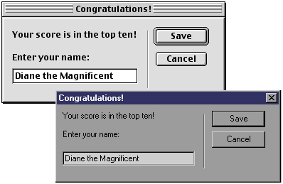
Add an Options dialog to your application.
Think of it this way: using MUI Xtra to build "Standard" dialog boxes is analogous to taking a MUI 101 class. Building "General Purpose" dialog boxes, which is a bit more laborious, is like MUI 201, with MUI 101 as a prerequisite.
MUI 201: databases into dialogs
When I used Microsoft Excel's macro language and Dialog Editor to build my first application several years ago, I felt a rush of power when I saw it in action. It gave me a geeky feeling of accomplishment to assemble databases of numbers and text strings into useful and functioning dialog boxes. All I had to do was build a table that described the dialog, and plug it into my program. Dialog boxes meant power, and they were driven by databases.
MUI Xtra lets you do the same thing: build a database that describes your dialog design, and run it within your program. Lingo's native database mechanism, the property list, allows you to arrange data into fields and values without the rows and columns of a spreadsheet-style grid. But again, essentially all you have to do is build a property-list database that describes your dialog design, and tell MUI Xtra to display it.
Well, that's almost all you have to do. Creating a General Purpose dialog box is a four-step process:
- Create an instance of MUI Xtra
- Set up properties of the dialog's window
- Set up properties of the dialog's contents
- Display the dialog
You can accomplish all four of these steps in a single handler, which you should write in a Movie script. Let's examine the Lingo involved in each step now.
Step one: creating a MUI instance
This step is very similar to what many Xtras require, but in MUI Xtra's case, you should declare the instance globally. Use the new() function to create the instance, then use objectP() to determine if new() was successful:
-- 1. Create a MUI Xtra instance
global oDialog
if not( objectP( oDialog )) then
oDialog = new( xtra "MUI" )
if not( objectP( oDialog )) then
oDialog = 0
alert "ERROR: Xtra instance failure."
exit
end if
end if
If this step fails, it's probably because the Xtra is missing from your application's Xtras folder. Drop a healthy copy from your Director Xtras directory into it, and all will be well.
When you create a MUI instance, it sets up some default property lists that make building your dialog a lot more convenient. You can access these via the getWindowPropList(), getItemPropList(), and getWidgetList() functions. These functions return the same lists every time; all you do is modify their properties to fit your needs. We'll start using them right away.
Step two: setting up window properties
Telling MUI Xtra what your dialog's window should look like is a simple, two-part process. In the first part, you obtain the list of default window properties by calling the Xtra's getWindowPropList() function. This part is identical from dialog to dialog, but the second part varies slightly depending on any dialog's needs. For the second part, you modify individual properties of the list from part one:
lsWindow = oDialog.getWindowPropList()
After this line is executed, the value of lsWindow is
[ #type: #normal, \
#name: "window", \
#callback: "nothing", \
#Mode: #Data, \
#xPosition: 100, \
#yPosition: 120, \
#width: 200, \
#height: 210, \
#modal: 1, \
#toolTips: 0, \
#closeBox: 1, \
#canZoom: 0 ]
Again, the results of getWindowPropList() are the same every time; if you don't want to change a property's value, you don't have to. getWindowPropList() provides a handy way to get window defaults, so you don't have to build the list each time.
Now all you need to do is update the properties you want to change to the values you need:
lsWindow.name = "My Dialog Box"
lsWindow.callback = "myDialogCallback"
lsWindow.xPosition = -1
lsWindow.yPosition = -1
lsWindow.width = 0
lsWindow.height = 0
In the example above, setting the #name property displays "My Dialog Box" in the dialog's title bar. Setting #xPosition and #yPosition to -1 centers the dialog on the screen. Setting the #width and #height to 0 causes the dialog to decide its dimensions automatically, based on the dialog's contents. Setting #callback tells the Xtra the name of the handler that will process interactions within the dialog. Stay tuned for an explanation of MUI callback handlers just after Step Four.
Note that there are three possible values for the #type property: #normal, #alert, and #palette. The default value is #normal, and I personally have never been able to get the #alert or #palette values to do anything different from #normal, on either Windows or Macintosh. I don't believe #alert or #palette functionalities have been fully implemented into the Xtra yet, but it may be that I haven't tried hard enough to get them working.
In addition, there are various properties that either don't work yet (#toolTips) or aren't cross-platform features (#closeBox, #canZoom). While these other property settings also yield useful results, this article excludes any explanation of them. You can find out more on their usage in this MUI help file, or better yet, experiment with them on your own.
Finally, there are three possible values for the #mode property: #data, #pixel, and #dialogUnit. These values determine how MUI lays out the dialog. In the default #data mode, the Xtra does most of the layout work for you, while #pixel mode provides you pixel-level control over layout. The #dialogUnit mode also allows you precise control, but since dialog units change as the system font changes, I've found it simplest to stick to #data and #pixel modes.
Step three: arranging the dialog's contents
Although not difficult, this is generally the most time-consuming step. Once you've done it a few times, you should be able to whip right through it. It's very helpful to make a quick sketch of your dialog's layout before you begin describing its contents. While the translation from your sketch to Lingo is fun, you may find that with practice the need for the sketch goes away.
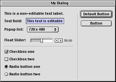
An example dialog containing nearly every widget type.
You'll remember that in Step Two, you defined a single property-list database of window properties called lsWindow. To describe dialog contents, you'll build a linear list that will hold a property list for each element in the dialog. Since this means you'll build property lists representing both visible widgets and invisible formatting values, this can turn into property-list mania depending on the complexity of your dialog box.
Begin by creating an empty list:
lsDialog = []
Remember the two-part process you used to format lsWindow? You'll follow an almost identical process to add content elements to the list. In this case, retrieve a default list of widget properties from the getItemPropList() function, modify its default properties, and add it (rather, a duplicate) to the linear list. Confused yet? Don't be; add the first element now, and you'll see how easy it can be. A simple formatting value tells the Xtra that you're starting to define the window contents:
formatter = oDialog.getItemPropList()
After this line executes, the 'formatter' variable's value is:
[ #value: 0, \
#type: #checkBox, \
#Attributes: [], \
#title: "title", \
#tip: "tip", \
#locH: 20, \
#locV: 24, \
#width: 200, \
#height: 210, \
#enabled: 1 ]
You don't want the first element to be a checkbox, so you'll modify its #type property. Then duplicate 'formatter', and append the duplicate to lsDialog:
formatter.type = #windowBegin
lsDialog.append( formatter.duplicate() )
Congratulations! You've added the first element to your dialog box. From this point forward, you'll follow this same process for each new element you add. Now let's look at the Lingo required to add each widget to the dialog:
-- ADD A NON-EDITABLE TEXT LABEL
widget = oDialog.getItemPropList()
widget.type = #label
widget.value = "My dialog will display this text."
lsDialog.append( widget.duplicate() )
-- ADD AN EDITABLE TEXT FIELD
widget = oDialog.getItemPropList()
widget.type = #editText
widget.value = "Default text"
lsDialog.append( widget.duplicate() )
-- ADD A CHECKBOX
widget = oDialog.getItemPropList()
widget.type = #checkBox
widget.title = "My Checkbox"
widget.value = TRUE -- checked by default
lsDialog.append( widget.duplicate() )
-- ADD A RADIO BUTTON
widget = oDialog.getItemPropList()
widget.type = #radiobutton
widget.title = "My Radio Button"
widget.value = TRUE -- checked by default
lsDialog.append( widget.duplicate() )
-- ADD A STANDARD BUTTON
widget = oDialog.getItemPropList()
widget.type = #defaultPushButton -- or #pushButton
widget.title = "OK"
lsDialog.append( widget.duplicate() )
-- ADD A GRAPHIC CASTMEMBER
widget = oDialog.getItemPropList()
widget.type = #bitmap
widget.value = member("myDialogGraphic")
lsDialog.append( widget.duplicate() )
-- ADD A SLIDER
widget = oDialog.getItemPropList()
widget.type = #integerSliderH -- or #floatSliderH
attributeList = [:]
attributeList.addProp( #valueRange, [ #min:1,#max:100,#increment:1 ] )
attributeList.addProp( #sliderStyle, [ #ticks,#value ] )
attributeList.addProp( #layoutStyle, [ #left ] )
widget.attributes = attributeList
widget.value = 50
lsDialog.append( widget.duplicate())
-- ADD A POPUP LIST
widget = oDialog.getItemPropList()
widget.type = #popupList
valList = [ "640 x 480", "800 x 600", "Full Screen" ]
popList = [ #normal ]
layList = [ #left,#minimize ]
attributeList = [ #popupStyle:popList, #valueList:valList, #layoutStyle:layList ]
widget.attributes = attributeList
widget.value = valList[ 3 ]
lsDialog.append( widget.duplicate() )
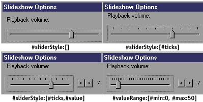
If you examine these examples, you can see that adding most elements is very straightforward and usually downright easy. While these examples show only Sliders and Popup lists to have #attributes, each widget type has this property. Configurable attributes include #textSize, #textStyle, #textAlign, #bitmapStyle, #sliderStyle and #valueRange, #popupStyle, #valueList, and #layoutStyle, to name a few.
Notice how modifying #attribute values only slightly can really vary the look of individual widgets:
Type put interface( xtra "MUI" ) in Director's Message window for details on which attributes individual widgets can have.
Formatting your dialog box
Formatting #types include elements that you use to organize your widgets into vertical and horizontal groups, vertical and horizontal line dividers, and markers for the beginning and end of a dialog window.
If you think of your dialog's layout in terms of horizontal and vertical groupings, you'll find it pretty easy to translate your sketch into Lingo. For example, if you want two radio buttons in a vertical group, you translate the formatting into a nested hierarchy, like this:
#groupVBegin
  #radioButton1
  #radioButton2
#groupVEnd
To add this group of buttons to your dialog, you repeat the process for each element, adding property lists for each one to lsDialog:
-- BEGIN A VERTICAL GROUP
formatter = oDialog.getItemPropList()
formatter.type = #groupVBegin
lsDialog.append( formatter.duplicate() )
-- ADD FIRST RADIO BUTTON
widget = oDialog.getItemPropList()
widget.type = #radioButton
widget.title = "Radio Button One"
widget.value = TRUE -- this button is "on" by default
lsDialog.append( widget.duplicate() )
-- ADD SECOND RADIO BUTTON
widget = oDialog.getItemPropList()
widget.type = #radioButton
widget.title = "Radio Button Two"
widget.value = FALSE -- this button is "off" by default
lsDialog.append( widget.duplicate() )
-- FINISH THE VERTICAL GROUP
formatter = oDialog.getItemPropList()
formatter.type = #groupVEnd
lsDialog.append( formatter.duplicate() )
Note that formatting values come in pairs, and you need to use them that way. For example, when you use #groupVBegin to start a vertical group, you must complete that group with a #groupVEnd. #groupHBegin and #groupHEnd work the same way, as do #windowBegin and #windowEnd.
Some widgets don't use a text-descriptor #title property, so you may want to include a #label instead, and format the two into a horizontal group. That is, while radio buttons, checkboxes, etc. have a text label associated with them, sliders and popup lists do not, so if you want to include one you should format them into a nested group. If your dialog needs a horizontal group, you can format it like this:
#groupHBegin
  #label -- "Jpeg Quality:"
  #integerSliderH
#groupHEnd
If the formatting #types aren't accurate enough to lay out your dialog's design, you can set its #mode property (a window property in lsWindow) to #pixel. Again, this will give you pixel-level control of the width, height, and placement of each widget.
Step four: displaying your dialog
This is the easiest of the four steps. Now that you've built lists describing the dialog window and its contents, you pass them to the initialize() function, then run the dialog:
initialize oDialog, [ #windowPropList: lsWindow, #windowItemList: lsDialog ]
run oDialog
Poof! There's your dialog box in all its glory. The Xtra now begins firing events to a special handler that you design specifically to process user interactions that occur in the dialog. In other words, whenever your user enters text, drags a slider, clicks a checkbox, or interacts in any other way with your dialog box, the Xtra tells this handler exactly what happened, so that the handler can determine what to do in response. You already named this handler, albeit perhaps unknowingly, in Step Two above. That handler is this dialog's callback handler. While the four-step handler you just wrote has made your dialog design a thing of beauty, a callback handler makes it a living reality.
Now that your dialog box is running, you may find that you can't make it go away. That's because you haven't written the callback handler yet, and until you do, the dialog isn't good for much. In the meantime, press the ESC key to get rid of the dialog box.
Step four and a half: incorporating a callback handler
For each event that MUI registers within your dialog, it sends these three pieces of information to whichever handler you specify as that dialog's callback handler:
- the event type (symbol)
- the widget's position within #windowItemList (integer)
- the widget's current properties (property list)
The first few lines of a basic callback handler look like this (note that this includes events that you probably won't need to deal with):
on myDialogCallback event, eventData, itemPropList
if symbolP( event ) then
case event of
#windowOpening, #windowClosed:
exit
#windowZoomed, #windowResized:
exit
#itemEnteringFocus, #itemLosingFocus:
exit
Your callback handler should primarily consist of case statements that identify the current widget, with instructions on how to handle changes to it. Add this to the outermost case statement:
#itemChanged:
case itemPropList.type of
#checkBox, #radioButton:
put itemPropList.title & ":" && itemPropList.value
#editText:
put itemPropList.value
#integerSliderH, #floatSliderH:
put itemPropList.value
#popupList:
put itemPropList.value
end case
#itemClicked:
case itemPropList.type of
#defaultPushButton: oDialog.stop( TRUE )
#pushButton: oDialog.stop( TRUE )
#cancelPushButton: oDialog.stop( TRUE )
end case
end case
end if
end
This stripped-down callback handler will at least serve to close your dialog box when you click a button, and should get you started writing your own. Step through each callback event in the debugger, and you'll see how you can customize this handler to fit your needs. You'll also want to look into the Xtra's itemUpdate() command, which updates widgets in response to interaction while the dialog is being displayed.
There are as many uses for General Purpose dialog boxes as you can dream up. You can add Preferences or Options dialogs to your app, Password Login screens, interactive splash screens, or a simple volume slider. Unfortunately, MUI Xtra isn't Shockwave-safe, so you can't use it in a browser.
Download sample Director 7 MUI Xtra scripts for Mac or Windows.
Copyright 1997-2026, Director Online. Article content copyright by respective authors.