I Want Real Looking Menus!
May 1, 2000
by Alan Levine
This column began a while ago. However, the last few weekends, my time has been filled with scraping and sanding the paint from the exterior of my house and prepping it for new paint. Why is this relevant?
As I am perched up there on the ladder scraping away, I was thinking that I could have taken the easy route and hired someone that would come in to do the whole job. I could be inside sipping a beer. But the hired hands would not do nearly the amount of prep work and they would have slapped on the new paint as quick as they could cash my check. You just get more satisfaction and more custom results when you do the work with your own hands.
And then I thought, it is like that with coding Lingo. You can take the quick and easy route, drag some pre-built behaviors onto your cast and never get your fingernails dirty in the code underneath. That is fine for many cases, but for me, I want to get in the guts and do the job myself.
When I look at some of the behaviors in the Behavior Library that comes with Director, I immensely respect the work of the folks like James Newton and Darrel Plant that have written them (and who code circles around my meager efforts). But I generally find myself thinking that they are, well, "fat" with stuff I do not need in my projects. Lots of error checking and more options than I often need.
This column started out with a theme of taking one of the Director behavior Libraries on a Jenny Craig code diet, but once I started customizing it to my purpose, I think I may have strapped a few pounds back on. But what I will show you, is something I have always said is sorely needed in Director- the ability to create interface elements that look like other OS standard interface elements (see my previous rant on Between Faces).
One of the first things I pecked Lingo out that used objects was a thing called the Popper, that created dropdown menus from field cast members, where each was spawned as an object, used, and discarded. But while it worked great, it did not look exactly like Mac or Windows menus.
I have also used the dropdown list behavior from the D7 Library Palette to create menus, and it works great as pulled right off the shelf. Underneath the hood, there is some nifty code to make the field sizes re-adjust, especially near the margins of windows. In fact, I scratch my head in looking at the code to see how it does a lot of its work.
What I do not like is that the menus do not look like menus! They are just a text field, and there is no visual interface clue that this thing on the screen is a navigation element. I know it works like this because I put the thing in there. And I prefer not having to put little label text that says, "Click and hold to see a menu". Yeccch.
What I want is a menu that looks like a Mac widget menu on a Mac and a Windows widget menu on a PC. And while I could use an Xtra like PopXtra, my Lingo devil keeps saying, "I bet I could roll it in Lingo"
So here is what I made:
When you click on the twitching logo beneath "show me", it will take you to a screen with two drop down menus. If you are on a Windows, they should look like Windows menus and if you are on a Mac... you can guess the rest. If you click the light switch on the right, you can see how they would look on the other platform.
When you play with the menus, they simply pop some feedback text on the screen, echoing your selection. The little checkbox marked "rude ancestor" (the meaning is below, but it no reflection on your heritage!), the feedback text generated from a selection on the bottom menu will change.
So that is what we'll do this time around.
But first a warning! This article is not going to spell it out like a recipe. If you are fearful of the script window, this is not for you. If you need to use a pre-built behavior to keep the playback in a frame, ditto. If you have never written a handler from scratch, step to the side.
Ok. Is anyone left?
You might first want to grab the source code.
Director 7 download for Mac or Windows.
Now let's start with a look at menus.
Graphic Anatomy of a Menu
When you look at Mac and Windows menus, they both have similar parts. There is a left side margin, a central area of variable width, and a right side margin with some sort of button.
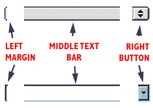
So with three graphic members we can create a menu widget of arbitrary length since we can stretch the middle part to any width. The menu text can be a field that sits on top.
Therefore, we can create two cast libraries with the appropriate elements for each platform.
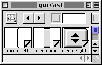
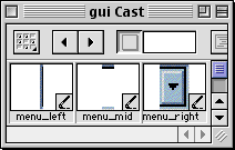
And when we start up our Director movie, we just need to track whatever platform we are on:
on prepareMovie
global gPlatform
if the platform contains "Windows" then
gPlatform = "win"
else
gPlatform = "mac"
end if
end prepareMovie
The demo uses a global to store this since in other places, it needs to test and switch the value. Those with strong aversions to globals could simply embed this code into their sprite initialization handlers and store it in a property.
Just for fun, each platform specific menu also has 1-bit cast members for a hand cursor and mask for rollovers. At this point all we have are the pieces of a menu.
Jenny Craig Time for This Behavior
The behavior in the library has a bunch of code for error checking. On my solo coding projects, I am assuming I know what I am doing and will delete the following handlers:
on ErrorAlert
on PermittedMemberTypes
Also, I do not plan to be calling the handlers from all over the place, so I strip out:
on DropList_Selection
on DropList_SetContents
The library behavior offers some flexibility on whether the action will jump to a frame, another movie, or execute a custom handler elsewhere in a movie script. I took a different approach for assigning the functionality of the behavior shown below, that separates the functionality of the menu from what it does in response to a selection.
on DropList_ToggleExecution
on DropList_GetReference
on GetMarkedFrames
on CreateMovieLists
on GetCurrentMarker
I also can discard ta bunch of the comments at the top, as well as these properties (simplifying the getPropertyDescriptionList).
property myName
property myContent
property myAction
property myStandard
Now we have hacked some things from the behavior. The properties I added that will be used below are:
property myOrigSelection, myAncestorScript, ancestor
The first one keeps track of which menu item is displayed by default and the second two help identify another script that contains the functionality of the menu. More on that later.
The setup
What is not so easy to do as drag-and-drop is to set this up in the score. I have to use 3 graphic sprites and a field to make the menu, and this implementation requires they are stored in a specific order:
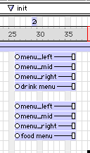
Each menu (in the two example menus above) has a field member sprite in the highest of the 4 channels, with menu parts in the specified order in the 3 channels below. This structure would need to be re-created for each menu you need.
This is where I start thinking it would make a lot of sense in Director to be able to define all of this in a mini-score, and encapsulate it is a single object in the big score. In a way film loops do this, but they are closed as objects, and are limited in what you can do inside of them with Lingo. I am thinking of objects that would have their own score, that you could open and edit, but insert in your movie as one sprite, not 4. But not in this version.
Making the Menus Work
Now that we have whittled the behavior down, we are going to beef it up with new code.
There are a few more things to do on initializing; we have to position the 3 graphic sprites relative to the screen location of the field. This was made easier by setting the registration points of the graphic elements as follows:
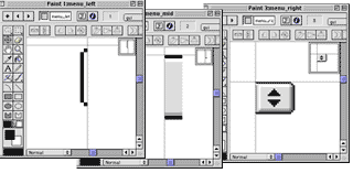
By setting these registration points in the paint window (see, it does have some use!), it makes it easier to position the menu elements relative to the field that contains the field cast member that defines the field. The left side of the menu graphic can be located to match the loc property of the menu field cast member (its upper left corner). The middle sprite can be stretched to match the width of the menu field cast member, and since its regPoint is in the upper left it can be set the same loc as the left side graphic. And the right side graphic, with its regPoint, can be positioned to match the upper right corner of the menu field cast member
The standard behavior takes care of sizing the field correctly, so we just modify the positions of the graphic sprites, from the Initialize handler called from on beginSprite. The (sNum-X) values are based on the position of the graphic components in the sprite channels.
-- store the menu size
menuRect = mySprite.rect
-- left side of menu is 3 channels up
sprite(sNum-3).member = member ("menu_left", "gui_" & gPlatform)
sprite(sNum-3).loc = point(menuRect.left,menuRect.top)
-- menu bar body
sprite(sNum-2).member = member ("menu_mid", "gui_" & gPlatform)
sprite(sNum-2).width = menuRect.right - menuRect.left
sprite(sNum-2).height = sprite(sNum-2).member.height
-- align the middle part with the left side
sprite(sNum-2).loc = sprite(sNum-3).loc
-- menu bar right side
sprite(sNum-1).member = member ("menu_right", "gui_" & gPlatform)
sprite(sNum-1).loc = point(menuRect.right,menuRect.top)
Note that we assign the appropriate graphics (using our global value of the platform), using the format:
member( memberNam, castLib)
... to select a named member from a particular castLib.
When the menu is not active, the sprite that holds the field needs to display with a background transparent ink (ink=36) so you can see the graphic element behind it and with no border or dropshadow on the field. This is also set in the Initialize handler:
myListMember.border = 0
myListMember.boxDropShadow = 0
mySprite.ink = 36
But when the menu is activated, it needs to have copy ink (ink=0) and its borders turned on. This is added to the OpenList handler, which is called by mouseDown events to display the menu:
mySprite.ink = 0
myListMember.border = 1
mySprite.locZ = 48
The other thing I discovered was it is hard to stack a series of menus vertically, because the menu in the highest channel is always on top (image). This is quite easily fixed by setting the sprites's locZ property in this handler. I chose 48 for this small demo, you might choose a higher number for a big project, or even make it a property. This little known trick (you cannot find locZ in the docs!) effectively allows you in lingo to tell the sprite to act as if it were in channel 48, on top of everything else, without doing sprite swapping with a dummy sprite. You can dynamically change the layer order that is in the score.
When we are done with the menu, the closeList handler needs some code to reverse the menu to its initial state with background transparent ink and no border:
mySprite.ink = 36
myListMember.border = 0
mySprite.locZ = me.spriteNum
The other piece of the puzzle is that the button graphic for the right side of the menu needs to be smart and send events to the sprite with the dropdown behavior. This is done by its own behavior that is used to send messages to the droplist behavior. The beginSprite handler assumes the menu is in the next highest sprite, and then it sets a custom cursor from the appropriate castLib.
property myMenuSprite
on beginSprite me
myMenuSprite = me.spriteNum + 1
sprite(myMenuSprite - 1).cursor = [member "up", member "up_mask"]
end
The following handlers route mouseDown and mouseUp events to the sprite in the droplist behavior.
on mouseDown me
sendSprite( myMenuSprite, #mouseDown)
end
on mouseUp me
sendSprite( myMenuSprite, #mouseUp)
end
And these two handlers close the menu at the appropriate times.
on mouseUpOutside me
if not rollOver(myMenuSprite) then
sendSprite( myMenuSprite, #CloseList)
end if
end mouseUpOutside
on mouseLeave me
if the mouseH > sprite(myMenuSprite - 1).right then
sendSprite(myMenuSprite, #CloseList)
end if
end mouseLeave
The Biggest Step, Call in the Ancestors
At this point I can make menus pop and drop, but how to go about having them do different tasks?
Sometimes they are purely navigational in function (go here, go there), but there is almost an infinite range of interactions I might want to generate.
In the original behavior, the function of the menu was set by an "execute" property in the getPropertyDescriptionList, allowing three modes:
- Every name in the menu was a movie handler, thus requiring that all menu items were single words.
- Every name in the menu is a marker or a movie name that we can then branch to. Again, this puts some restriction on the text that can appear in a menu
- Query the status of the menu externally by a SendAllSprites command to a function in the behavior that would return a property list which would then need to be parsed and an action could be taken.
The latter is the most flexible, but I am always looking for ways to avoid a lot of message broadcasting like sendAllSprites. Plus it is not even driven from the menu itself -- it must be polled by something like an exitFrame or idle handler. And I may want a complex mode menu, where sometimes all the items are just for navigating to other frames, other times each item is to execute custom code, or some mixture of both.
After a lot of thinking and poor attempts, I decided the best way to handle the interactivity was to separate that code that reacted to the menu out from the menu functionality of the droplist behavior, and assign another behavior as an ancestor. This way I could have menus all over my movie, and even swap functionality by changing ancestors at run time.
Pretty hairy stuff! Stand back, I am a scientist.
The first part is to add as properties to the droplist behavior a string that represents the name of the ancestor script, and a property that is just "ancestor":
property myAncestorScript
property ancestor
The value of myAncestorScript is set at run time by getPropertyDescriptionList, and the ancestor property is set in the Initialize handler:
me.ancestor = new (script myAncestorScript)
What does this do for us? By having an ancestor property, we can send messages from our menu dropList behavior to whatever script we have defined as the ancestor.
All of the menu actions in our droplist behavior are funneled from mouseDown events to a CheckClick handler (that ensures an item was truly selected) to a doCustom handler that actually dispatches a command.
I like to have menu items that are non functional, such as the first line:
Select...
Plus, it can help to have menu separators (lines of dashes), so we first can test for these cases, and if they are the selected item, we take no action and reset the menu selection to whatever was defined as its original/default selection:
on doCustom me
theItem = myItemsList[mySelectedItem]
if (theItem contains "--" or theItem contains "...") then
ScrollTo (me, myOrigSelection)
else
-- send message to ancestor script to do
-- menu specific functions
menu_action (me, mySprite, mySelectedItem, theItem)
end if
end doCustom
Now this is doing more or less what the original droplist behavior did, but rather than having to poll for it by a sendAllSprites, we send directly the selected menu sprite reference, the number of the item in the list, and the text of the menu item to a handler menu_action that resides in the ancestor script.
Get it? I said it was hairy.
What does the ancestor script look like? I made the default of the getPropertyDescription list assign one called "basic":
on menu_action me, spr, menu_item, menu_str
alert ("menu_action called from" && spr & return & "item #=" && menu_item & return & "item string=" && menu_str)
end
on cancel_menu me, spr
sendSprite( spr, #CloseList)
end
Now this handler merely echoes the parameters it received from the droplist behavior it is associated with. You could do all kinds of logic hinging on the value of the menu string or the number of the menu item. Note also, that my taking the sprite reference from the menu that called this, we can send messages back to the droplist behavior. For example, one of the logical branches could be to do nothing, and could call the cancel_menu handler to tell the menu to close itself.
But what is even slicker, is that you can swap the ancestor of the droplist behavior at run time, effectively changing how it reacts to selections.
In the shockwave demo of this movie above, the menu responds with some simple feedback to a text member, that starts with "Congratulations! You selected ...." If you download the source movies for this article, and play it in Director, you can swap ancestors by opening the message window and typing:
sprite(5).ancestor = new (script "rude")
This changes the ancestor from script "basic" to a copy of this script named "rude" -- in this code, the feedback to a menu selection for the menu stored in sprite 5, "Hey Doofus! You managed to select..."
Now this should open up all kinds of doors to possibilities. The ancestor script could even have cases that swap it for another ancestor (oh my head hurts!).
Is anyone still with me?
The Bottom Line
My real goal was showing that it is possible to use Lingo and some graphics to make menus that look and act like real system menus. Beyond scrolling text and fields, Director makes it so hard to build things that look like other applications. Its buttons from the Tool palette do not look like system buttons.
And my secondary goal is to show that sometimes you can hack and puff up existing code to do what you want to do. This article was in no way a critique of the droplist behavior written by James Newton -- in fact, without this as a starting point, I may not have gotten very far.
In the end, it really pays not to rely on drag-and-drop solutions, the "build multimedia without programming" approach. I urge any Director newbie to grab their paint scrapers, wire brushes, sandpaper, and get dirty in the code.
One more note in closing -- in my last article, I made an off the cuff remark that Macromedia had never even sent me a T-shirt. Lo and behold, right after the article was posted, a FedEx package came from 600 Townsend St with a nifty black shirt.
So Megan, if you are reading again, what I really meant to say is that "Macromedia has never sent me a copy of Director 8 Studio. Or DreamWeaver. Or a candy red 65 'Vette. Or a Learjet...."
Next article -- just to contradict this article, I take an off-the-shelf behavior and use it, as-is, to add a post survey to a CD-ROM title, and use net operations to have results written to our web site.
That is, if I do not fall off a ladder this weekend.
Copyright 1997-2026, Director Online. Article content copyright by respective authors.