Isometric Views in Director: Theory and Game Application
February 6, 2001
by Charles Forman
Purpose
This is the first of a set of articles on isometric view theory and its application in Macromedia Director. This is actually a chapter in a book I am co-writing with many other talented Director developers. So if you like this article, email me and I’ll forward it on to the prospective publishers. There are very few existing well-written documents on isometrics. What few documents there are say pretty much the same thing, and leave gaping holes in some areas. This document assumes you have a good understanding of Macromedia Director 8 and Lingo. Hopefully, this will become a valuable resource for isometric view information, no matter what the development platform.
I thought that the best way to illustrate the isometric view is to apply it by making a game. I ported a very simple but fun mind game called "Theseus and the Minotaur" by Toby Nelson and Robert Abbott. I have also made the source available for you with some conditions. Please do not edit the graphics and call it your own. Please do not even copy one line of code. Simply look at the code and observe what is going on. Use it as an opportunity to teach and enlighten yourself. Then, go make your own game.
Take a look at the game, and see why you might be interested in the isometric view:
Controls: There are two modes, 0 degrees and 90 degrees. To toggle the control mode, press "t".
0 degrees: up, down, left, right & numeric keypad 8, 2, 4, 6
90 degrees: up+right, down+left, up+left, down+right & numeric keypad 9, 1, 7, 3
In either mode, you can use: k, z, m, a.
To pass a turn: press the space bar.
To restart the level: press "r".
To change the level: press "1" for -1 and "2" for +1.
To toggle sound: press "s".
Isometric View Description
The isometric view has been popularized by its "3D" representation of levels in games such as "Ant Attack" on the ZX Spectrum (the first isometric platform), "Zaxxon", and Atari's "Marble Madness" game. Since 1982, many game developers have continued to use the isometric view.
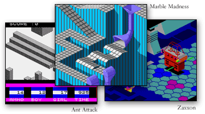
It should be stressed that the isometric view should be fully understood before deciding to use it in a game or application. Isometrics should only be used when illustrating depth or providing a non-standard way of looking at something. Isometric views tend to be visually complex, and unless used correctly, can take away from game play.
Most non-isometric views are oriented in a Cartesian straight-on fashion. Because the screen is square and the X coordinate increases as you move left and Y increases as you move down, it is very easy to draw contents to the screen in the same manner. Most platform games like "Super Mario Bros." use this view. Unfortunately, there is no perceptual depth in most of these games. Overlapping, scaling, and parallax scrolling are tools most often used to illustrate depth.
Parallax scrolling basically means that something behind and in front of the object of focus is being scrolled in parallel with the object of focus. Objects in the foreground will scroll quickly; background objects will scroll slower. Parallax scrolling does a nice job of illustrating the depth comparison. However, parallax rarely plays a meaningful role in the game play.
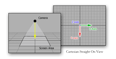
It is easy to think of an isometric view as the view from a camera, flying in any direction horizontally, over a landscape looking downward at a constant, unchanged angle. This could also be used to describe the Cartesian straight-on view. The difference is that the camera is rotated 45 degrees. The reason for this will be described below.
This illustration shows an isometric view, where the camera is looking straight on to the map at 90 degrees. This basically serves the same purpose as the above Cartesian view, as there is no perception of depth.
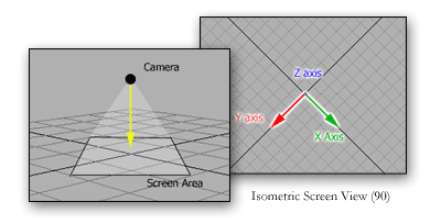
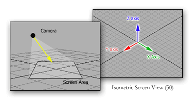
As the angle onto which the camera views the map moves away from 90 degrees, the Z-axis becomes more visible, thus giving the perception of depth. It should be noted that an isometric view is also an orthographic projection, or commonly known as parallel projection.
Orthographic Projection: that projection which is made by drawing lines, from every point to be projected, perpendicular to the plane of projection. Such a projection of the sphere represents its circles as seen in perspective by an eye supposed to be placed at an infinite distance, the plane of projection passing through the center of the sphere perpendicularly to the line of sight.
This basically means that there is no vanishing point. Objects in the foreground are not bigger than objects in the background. There are some games, like "Diablo 2" that bend this rule. This game scales the bottom tiles slightly larger than tiles above it. The result is very nice. This however, is difficult to do. Such an effect can be retrofitted later.
Tile-based Maps
Since the application of the isometric view is tile-map based, I will first explain the basics behind tile-based maps.
Have you ever seen a kitchen floor with some different colored tiles to form a intricate pattern on the floor? Well if you identify all the unique tiles on the floor and record which tile is place at every position on the floor, you have just made a tile-based map. In games, you take sections of pixels, usually a rectangle, and place them together to form a map.
The tiles could be stored as individual cast members, and the map could be stored as a two-dimensional list. For the example above, the map array list might look like this:
MapArray = [[0, 1, 0, 2, 0],
[0, 3, 1, 2, 4], etc.
There are many benefits from tile-based maps in games:
- File Size - Lets say you only have 10 unique tiles. With those tiles, you make a map that is 500X500. Instead of storing an image that 5000X5000, all you have to do is store the 10 images and the 500X500 map array.
- Memory - You only need to load the tiles into memory that you are going to display.
- Collision Detection - All collision should be done at the map level not the screen level. It's much easier to find out what tile is where by looking it up in the map.
- Versatility - Because the map arrays are much smaller than storing huge images, you can have many more maps in you game. You can also attach parameters to your map elements that make special things happen. Like hidden secrets, or slippery ice, etc.
- Random maps - You could create a program that generates random maps based on rules. It could make for some very interesting game play.
Isometric Tile-based Maps
Isometric maps are basically the same as rectangular ones. The difference is that the tiles are now diamond shaped. Notice how this tile is built. It is very important that they tile well. You can either create a tile so that the tile seamlessly butts edges with each other, or you can make the tiles so that they share edges with each other. I prefer to have the tile share edges (Overlapped).
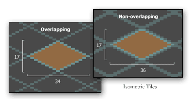
The other difference between rectangular and isometric is the orientation of the map. The biggest thing you need to understand is that the map coordinates are no longer easily translated into screen coordinates. The map's (0,0) position is not the top-left most tile. As the X coordinate increases, the screen placement is down-right. As the Y coordinate increases, the screen placement moves down-left.
Drawing Your Isometric Map
There are two different methods of displaying isometric map. One method, is to draw sections of the map (or the whole map if it is small enough) so that the bounds of the map are clearly visible.
This can be used for board games like checkers, or a dungeon type game. With this method, start by drawing a tile on the middle of the screen. Continue to draw down-left, row-by-row. This is the easiest procedure, because grabbing the map tile and placing it can be done simply in a repeat loop.
You will notice for tiles of varying height that as you draw downward, items in the foreground will be placed in front of the background. There is no need to depth sort.
The more common method is to fill the screen (or level area) with the maps contents, so that more of the map is leading off the screen. This method would be used with scrolling your levels as well.
Drawing this screen is a bit more difficult than the previous method. Because you don't want to draw what is not on the screen, drawing down-left row-by-row is no longer an option. The best method is to draw left to right, everything that would be visible on the screen. Start with the top-leftmost tile that will appear on the screen. Draw it, jump the tile’s width across, and draw the next one. Repeat until you reach the right side of the screen. Every other row will be offset horizontally by half the tile’s width. So go back to where the first tile was drawn. Jump down half the tile’s height, and back half the tile’s width. Jump across drawing each tile. Repeat this whole process until you have drawn the entire screen.
Because tiles in the foreground are placed over tiles in the background, you may want to consider drawing the screen even though you have filled the screen. Let's say you had a very tall building tile right below the screen area. This building would obviously cover part of the screen had it been drawn.
Taking Sprites into Consideration
Let's look at adding a character or sprite that can walk around the map. Sprites should always be moved in the map coordinates, and then have its coordinates translated to screen coordinates. The reason for this rule is that all collision detection needs to be done at the map level. The will become more apparent as collision detection is explained in a later document.
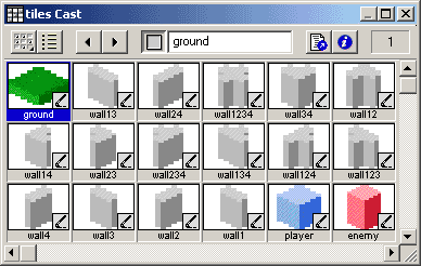
Let's say you want the character to walk around a map with tall buildings or walls. Obviously, the character may walk behind a building or wall. However, how will the character be hidden? I have thought about many solutions for this. First I thought about rendering the whole stage including sprites using imaging lingo; this would be too slow. Then I thought about using a line of sight algorithm to set the alpha channel of the sprite to the inverse of what was covering it up. That may have worked. I was talking with Elia Morling of tildruin.com about a solution. He graciously told me how he does it, and it solved my problem.
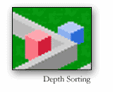
The method is to basically draw the floor (the lowest height in the isometric map) with imaging Lingo and place it on the stage as one sprite. No other sprite will or should be behind it. Any map element that has a height greater than the floor (anything that can potentially cover a moving sprite), should be placed as a sprite itself. Because Director has both a high number of available sprite channels, and a very nice compositing engine, placing many sprites on the stage is not a hassle. The locZ of each sprite, including characters, should be based on the vertical screen position of that sprite. So, as a character walks up and around the back of a building, the building covers the character because the locZ of the character is changing as it moves vertically. Depth sorting is suddenly very fast and easy.
I hope this helps to better explain the isometric view. Go ahead and download the source to the game above. Check it out and enlighten yourself. I may write an article on the game code itself if there is enough demand for it.
A sample Director 8 movie is available for download in Mac or Windows format.
Copyright 1997-2026, Director Online. Article content copyright by respective authors.